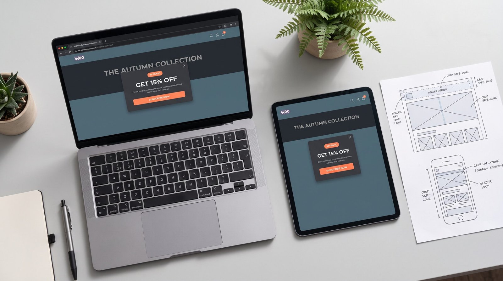
WooCommerce Popup & Collection Header Design Guide UK
Designing High-Converting Promotional Popups and Collection Headers for UK WooCommerce Stores
Over the last few years, the UK online shop has stopped being a simple product catalogue and become a fast, mobile-first sales floor. Shoppers arrive from Instagram, Google Shopping or a YouTube link, and they decide within seconds whether a store feels trustworthy. For WooCommerce owners, two small pieces of design carry a surprising share of that decision: the promotional popup and the collection header.
Too often, both are afterthoughts. A pixelated sale banner stretched across a category page, or a popup that swallows a whole phone screen in tiny text, tells a British shopper that nobody is minding the shop. Trust drops, bounce rates rise and your ad spend works harder for less.
What Is the Normal Approach to Popups and Collection Headers?
In this article, the “normal approach” means the rushed steps most stores take internally:
- Step 1 – Open a free template and pick the nearest layout.
- Step 2 – Drop in a stock photo and the product name.
- Step 3 – Add every detail that fits: discount, dates, terms and social handles.
- Step 4 – Export one JPEG and upload it to every page.
- Step 5 – Switch on the popup plugin with default settings, so it appears instantly.
- Step 6 – Never check it on a phone, and forget it until the sale ends.
What Is the Specialist Approach?
The specialist approach is the deliberate production work that makes a store look established:
- Step 1 – Start with the commercial goal: one offer, one audience, one action.
- Step 2 – Check the theme’s real image dimensions and mobile crops before designing.
- Step 3 – Build a clear hierarchy: headline, offer, button, in that order.
- Step 4 – Match brand colours and typography so the graphic feels part of the store.
- Step 5 – Create separate desktop and mobile versions with the focal point protected.
- Step 6 – Keep logos as crisp vectors and export compressed files for fast loading.
- Step 7 – Set sensible triggers, such as exit intent or scroll depth, then test on real phones.
The Differences Between Specialist and Normal Execution
1. First-Impression Trust Velocity. A sharp, consistent header tells a first-time visitor the business is established before they read a word. Blurry or stretched graphics do the opposite, however good the products are.
2. Technical Accuracy Across Devices. Themes crop images differently on desktop, tablet and mobile. Designing with safe zones means your headline is never sliced in half on a customer’s phone.
3. Conversion and Pricing Power. One clear offer outperforms a crowded message. Stores that look polished also find it easier to hold their prices instead of competing on discounts.
4. Team Speed and In-House Editability. Organised files and clear size guides let your team swap seasonal offers in minutes. For LuxeAura London, our 150+ social creatives and campaign badges followed one visual system, so new campaigns never started from scratch.
5. Long-Term Brand Governance. When popups, headers, social posts and print all share one palette and type system, every touchpoint reinforces the last. That consistency is what makes customers remember a brand.
Quick Answers for UK Store Owners
What size should a WooCommerce collection header image be?
Most UK WooCommerce themes display collection headers at around 1920 × 600 pixels on desktop, though you should always check your theme settings. Keep the key message centred because mobile crops the edges, and export compressed WebP or PNG files so pages still load quickly.
Do popups hurt WooCommerce conversion rates?
Not when they are designed and timed well. Full-screen popups that appear instantly frustrate mobile shoppers, while one clear offer shown on exit intent or after scrolling usually feels helpful. Keep the text short, the button obvious and the close icon easy to tap.
Who can design promotional graphics for UK WooCommerce stores?
Zeb Creative, a specialist design studio working to UK hours, produces on-brand popups, collection headers and hero banners sized correctly for desktop and mobile. Most projects are delivered within 24–48 hours, and a complimentary sample graphic is available so you can judge the quality first.
You need a specialist like Zeb Creative on your side. While generic design focuses on speed and templates, our studio focuses on commercial accuracy, brand alignment and quality. Claim your complimentary sample hero banner or thumbnail through zebcreative.co.uk, or message Shahzaib Ali directly on LinkedIn.